Disclaimer: Seattle Times isn’t a client of Bottega8. But I’m a reader of SeattleTimes.com news outlet and wanted to document ways in which their web presence can be better.
Recently, I was going through my twitter stream and came across a link tweeted by the Seattle Times that went to one of their own articles. When I clicked the link, it loaded an article that was formatted poorly on my mobile device. This prompted me to write a blog post about my experience and suggest ways in which The Seattle Times can improve their mobile offering.
I should note that they have a dedicated mobile website and a breadth of mobile apps but still miss a major user experience scenario of a common reader.
I’ll walk you through the experience that I had and show you what I mean.
Clicking on a Seattle Times Link on Twitter
The Seattle Times has a pretty large following on Twitter with about ~100k followers. Let’s see how someone engages with Seattle Times on mobile.
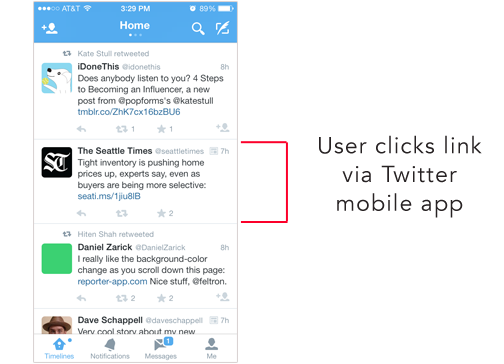
1. Here is a screenshot of Twitter’s mobile app showing a Tweet by the Seattle Times in my timeline. It’s common for people to get their news from their twitter feed.
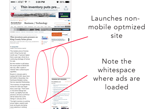
2. As soon as the reader clicks the link they’re presented with the desktop version of the Seattle Times article with large blocks of white space. The sites takes an extremely long time to load these high bandwidth ads delivering a sluggish experience.
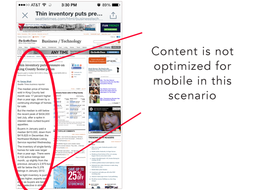
3. The content of the article is the most important part of the page but it’s barely even noticeable and usable.
Being that Seattle is one of the largest tech hubs in the US, the Seattle Times should actually improve the user experience of their mobile offering instead of just creating more apps.
In Summary
For the Seattle Times it all comes down to readership. If they have a high readership they’ll have an easier time convincing marketers and advertisers to partner with them. By providing a good experience, readers will keep wanting to come back.
Although, the SeattleTimes.com website has a mobile dedicated version of their website and multiple apps on almost every mobile platform they still haven’t thought through how their mobile website is actually playing a role in their readers lives. It’s not enough these days to have a mobile site and not think about the implications about how your audience will get to the Seattle Times website (like the common scenario I’ve described above). Ultimately, with the knowledge of how readers interact with the site will open opportunity to seamlessly integrate more effective ads based upon a specific device.
There are two suggestions that I believe the Seattle Times should take action on:
- Detect when a reader is accessing your site via a mobile device. (This can be done by easily getting a User-Agent String). Then redirect them to your existing mobile optimized website under your “m.” subdomain. This first step can be accomplished with not much effort.
- Plan to transition to a fully responsive site like the Boston Globe. With one code base you’ll be able to present a compelling user experience for any mobile device or tablet.
Hope this shines some light on where the Seattle Times could put some of their efforts behind.


